Datrium
Customer
Support
Portal.

Business-to-Business
Disaster Recovery
as a Service
Overview
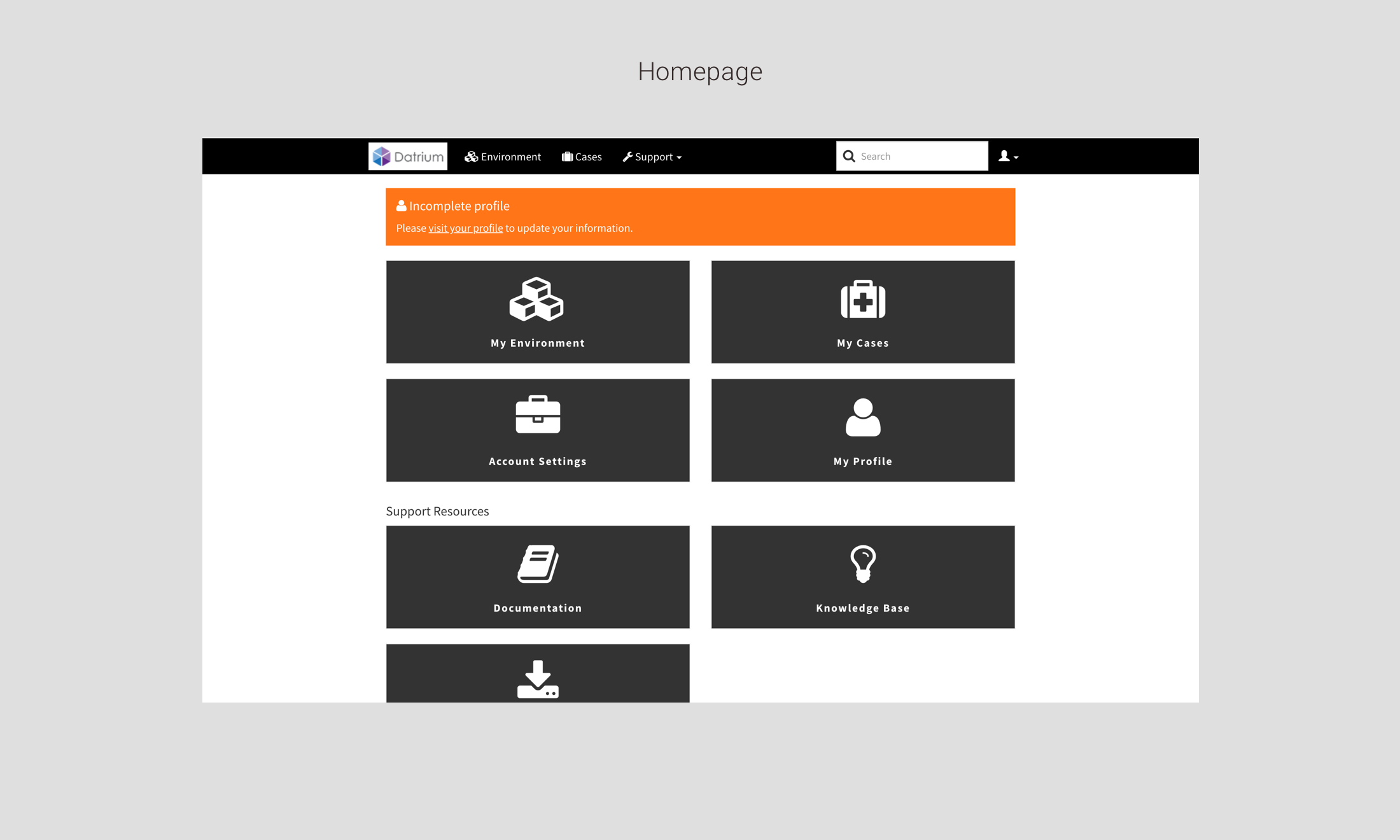
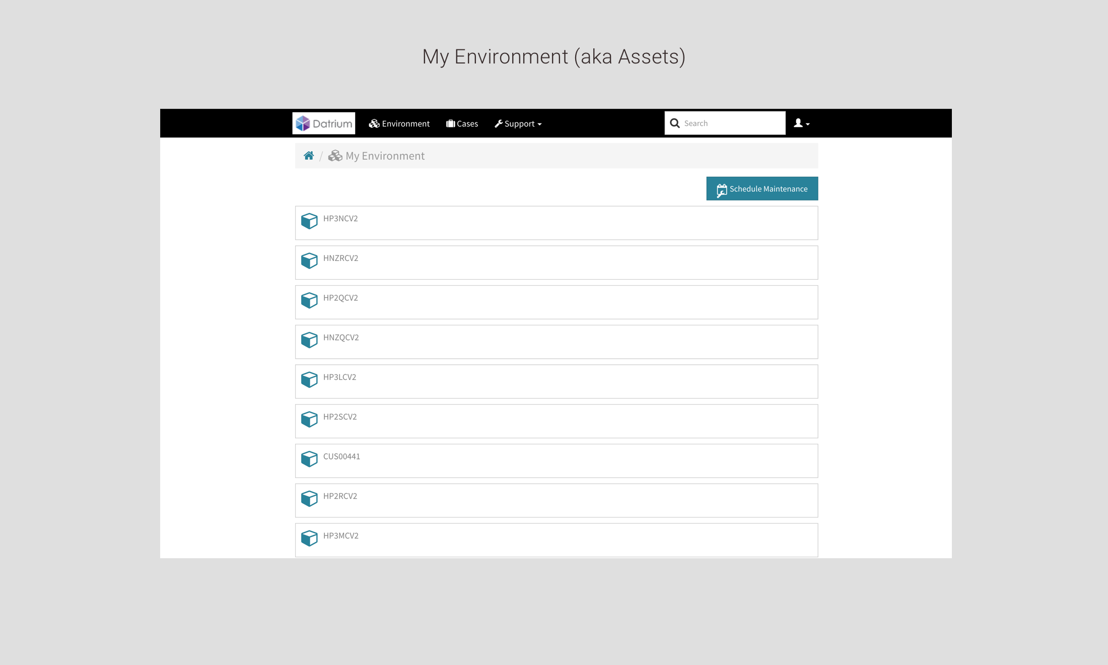
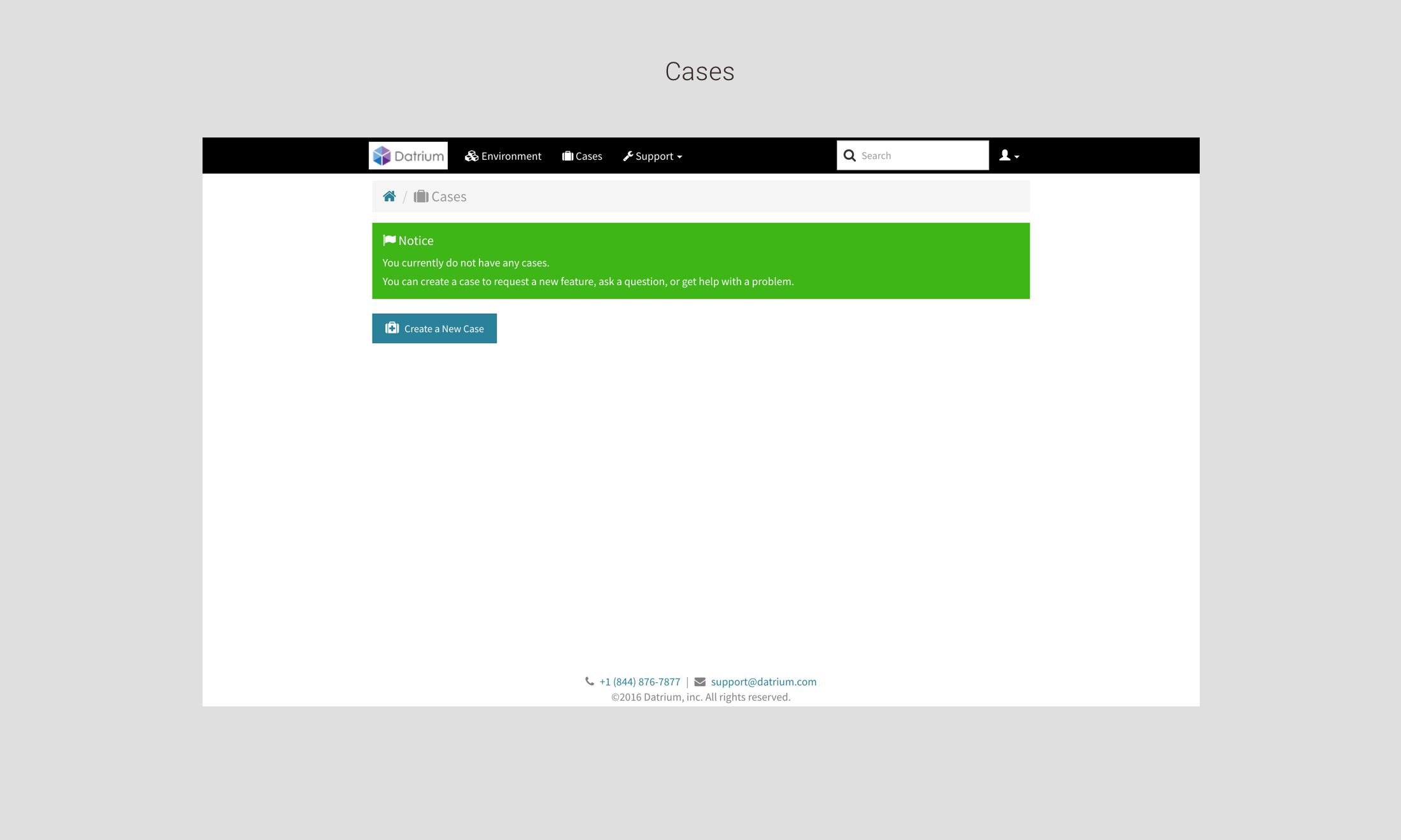
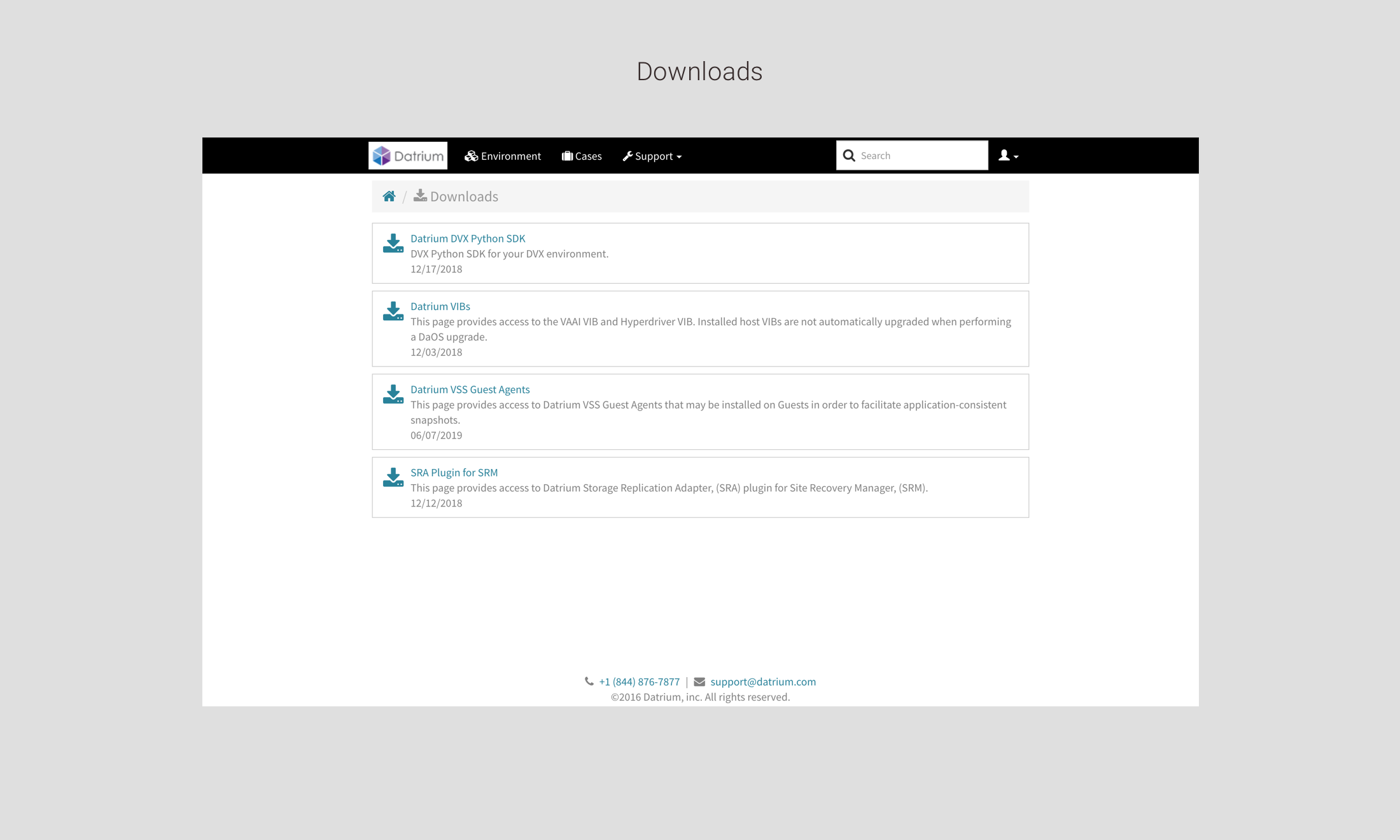
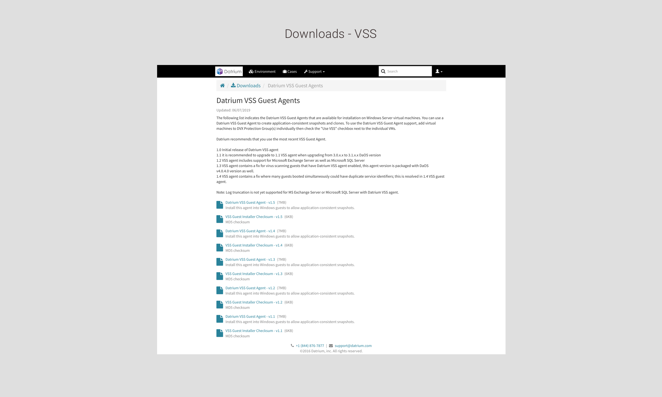
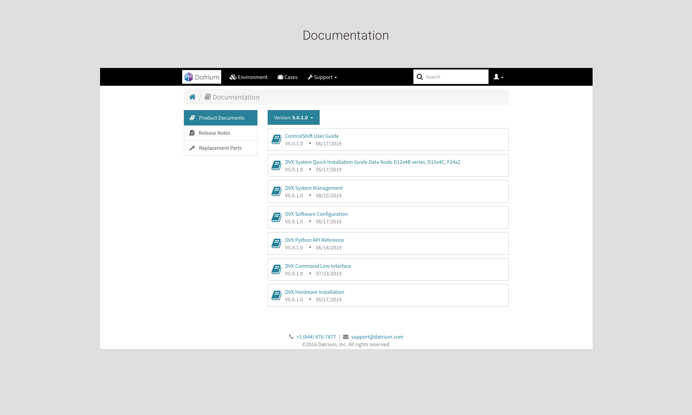
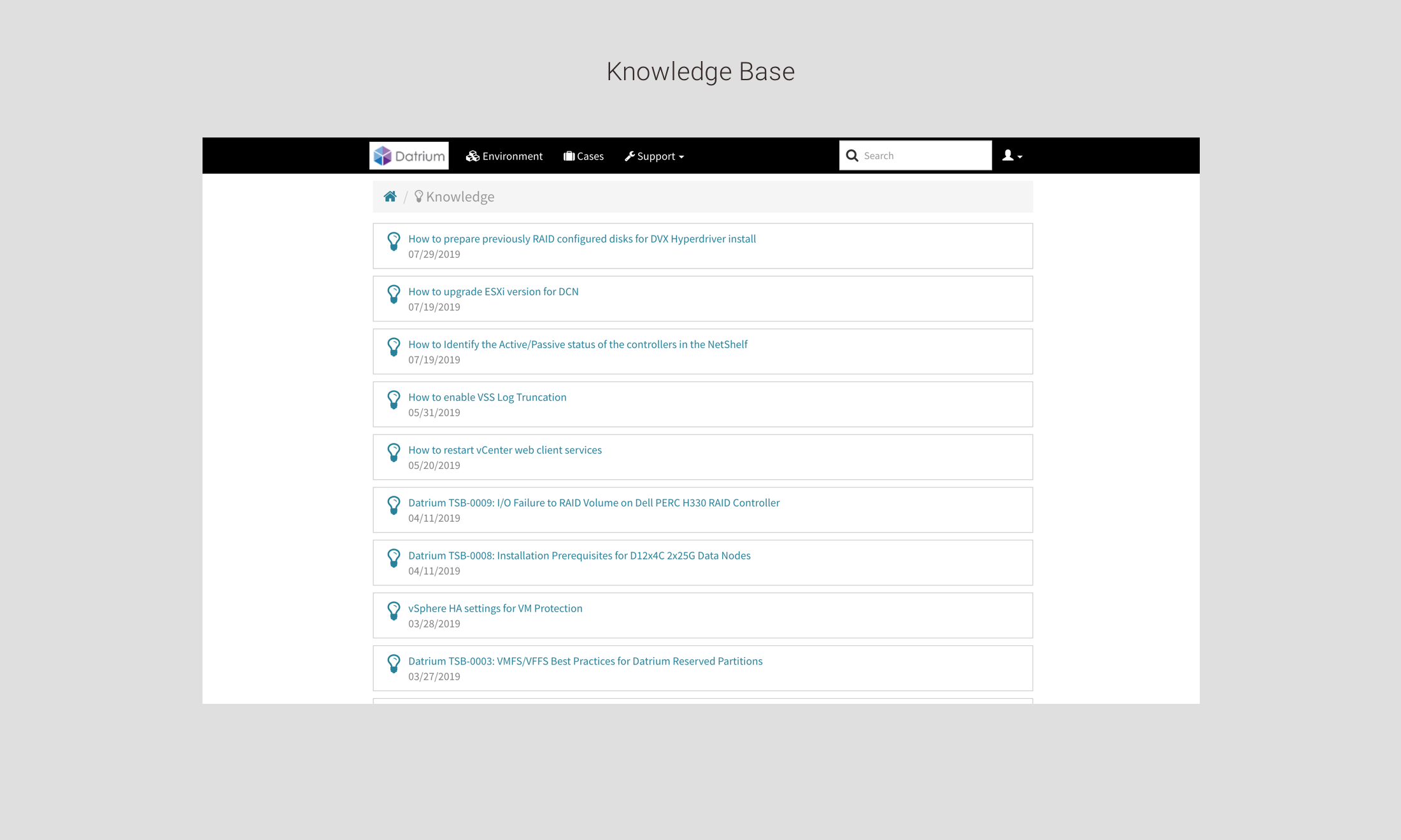
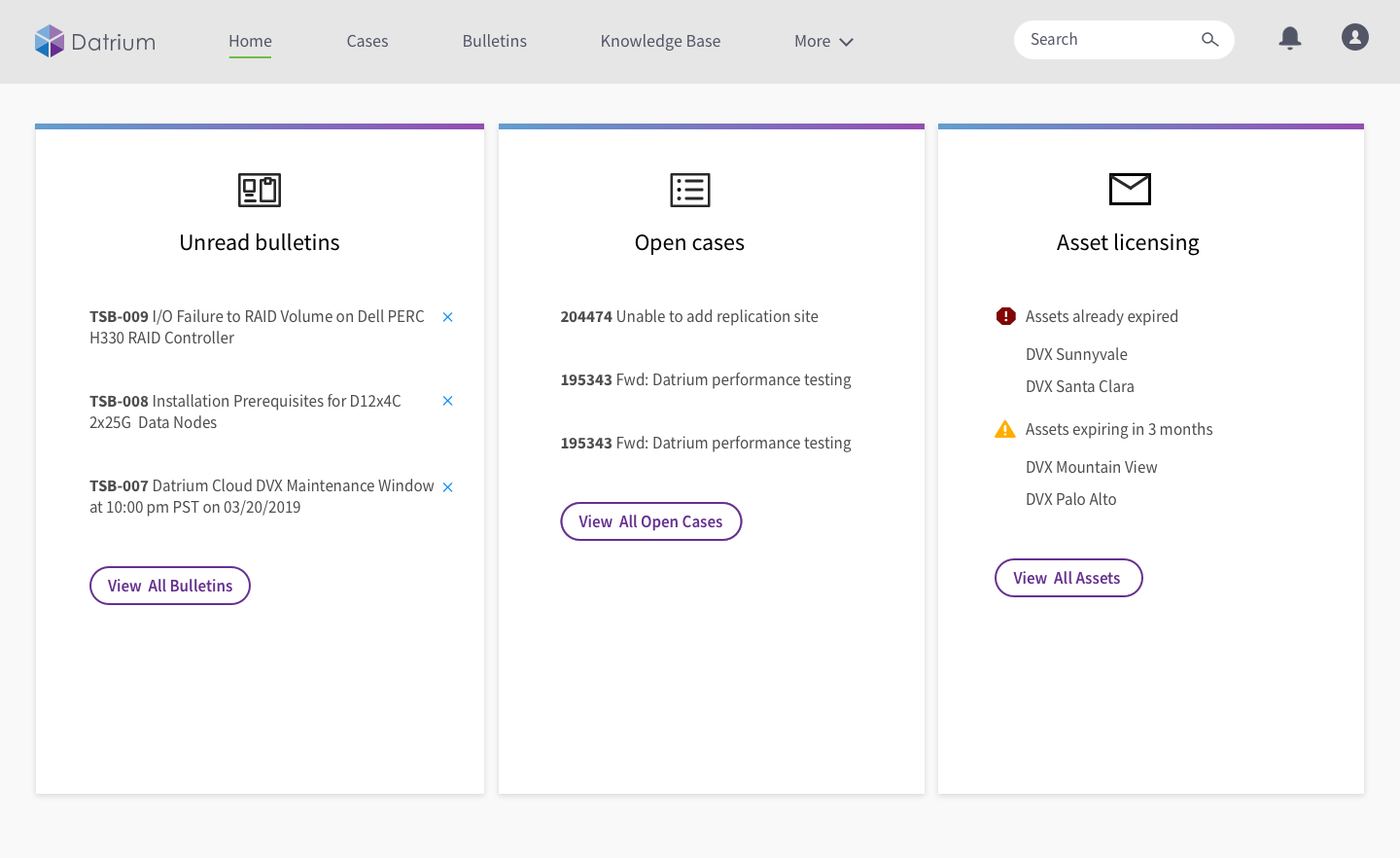
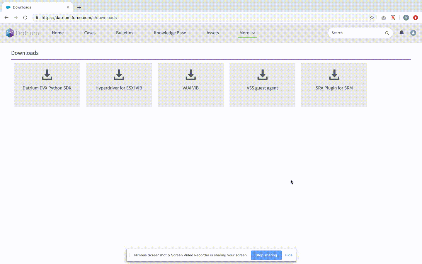
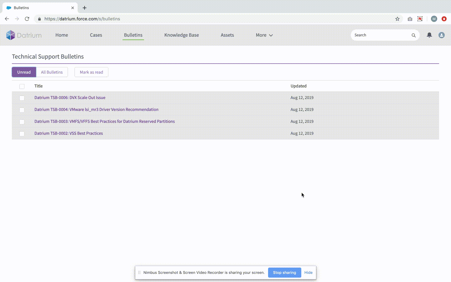
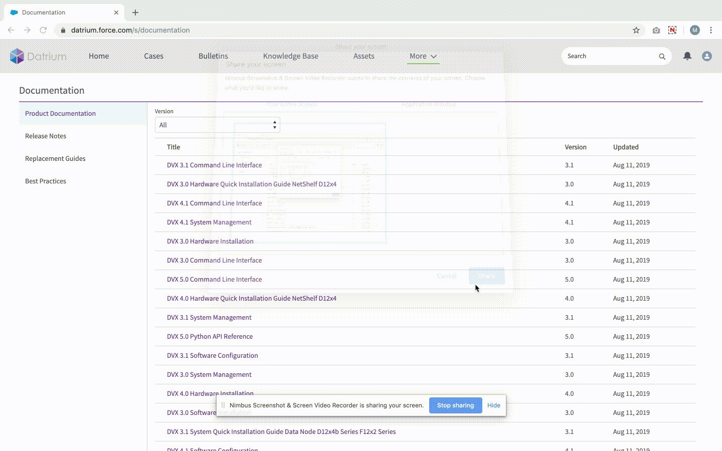
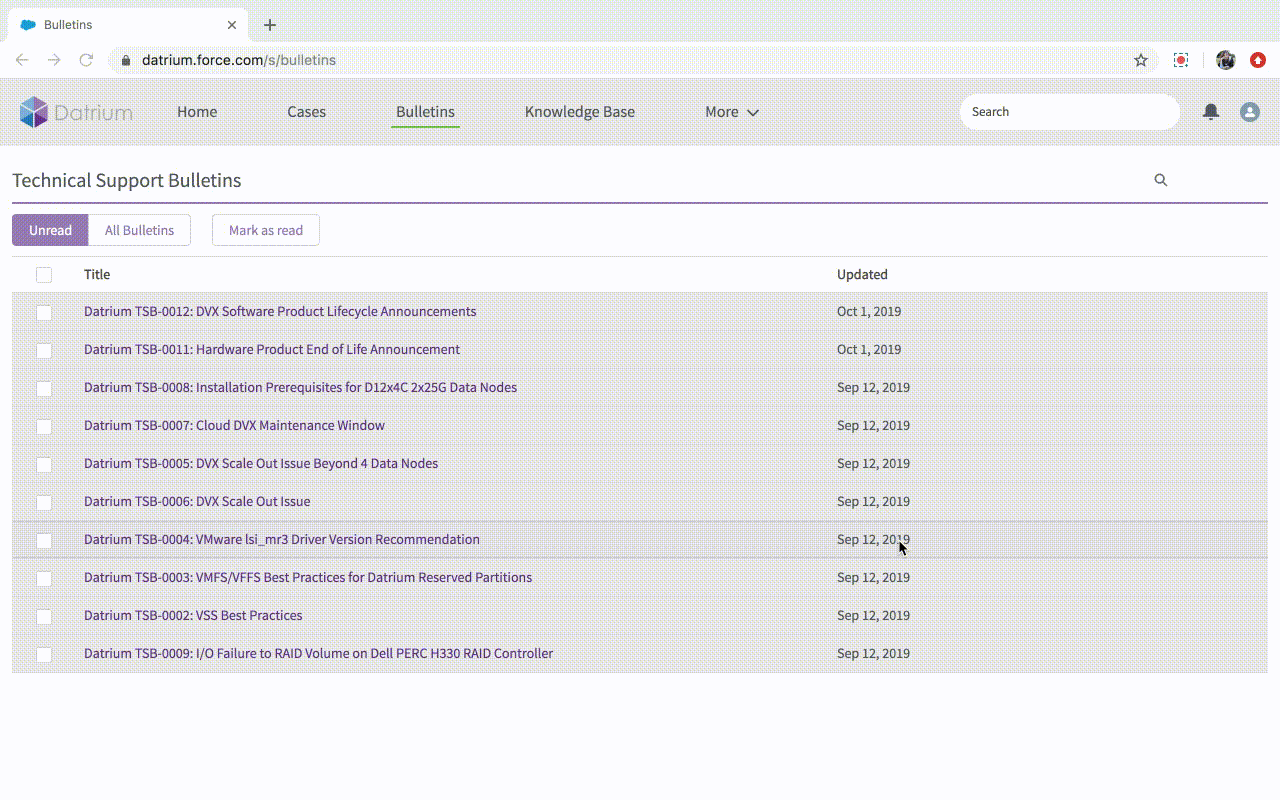
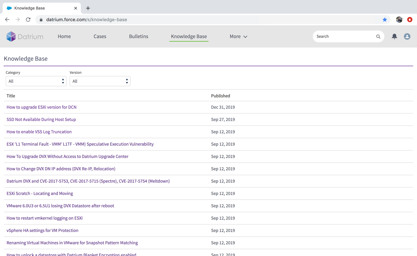
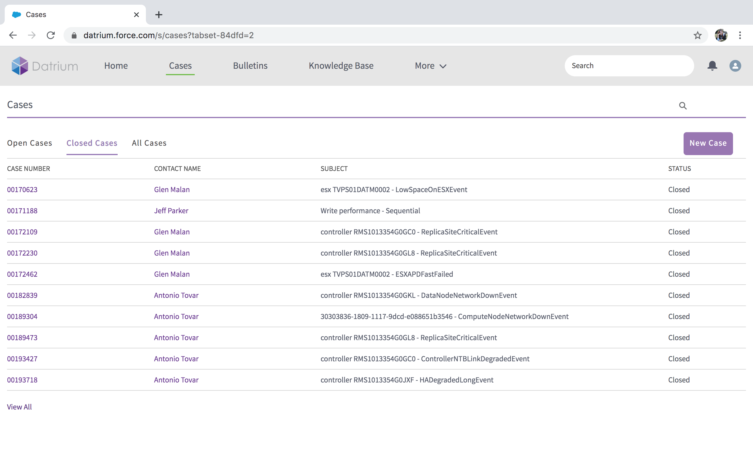
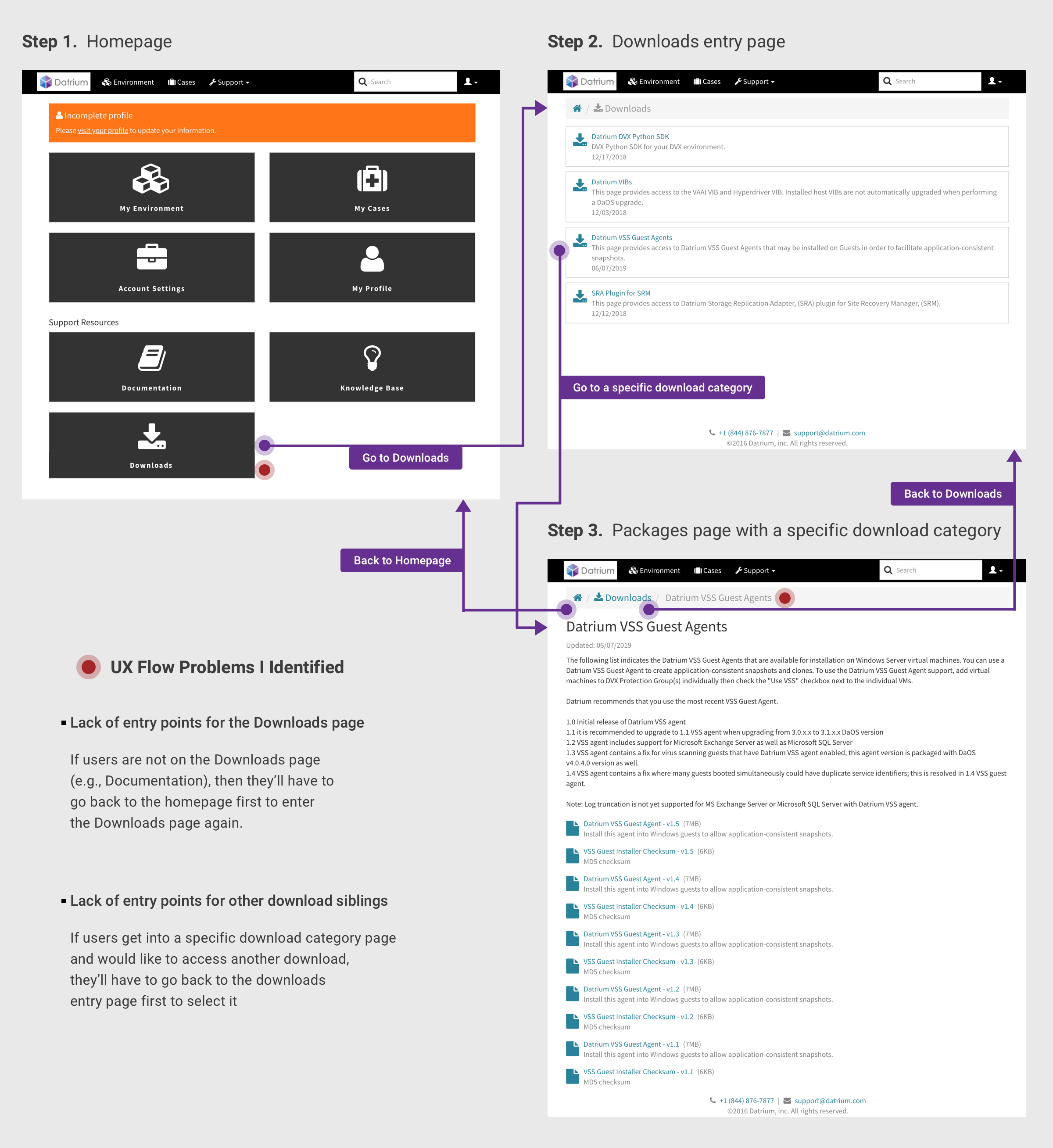
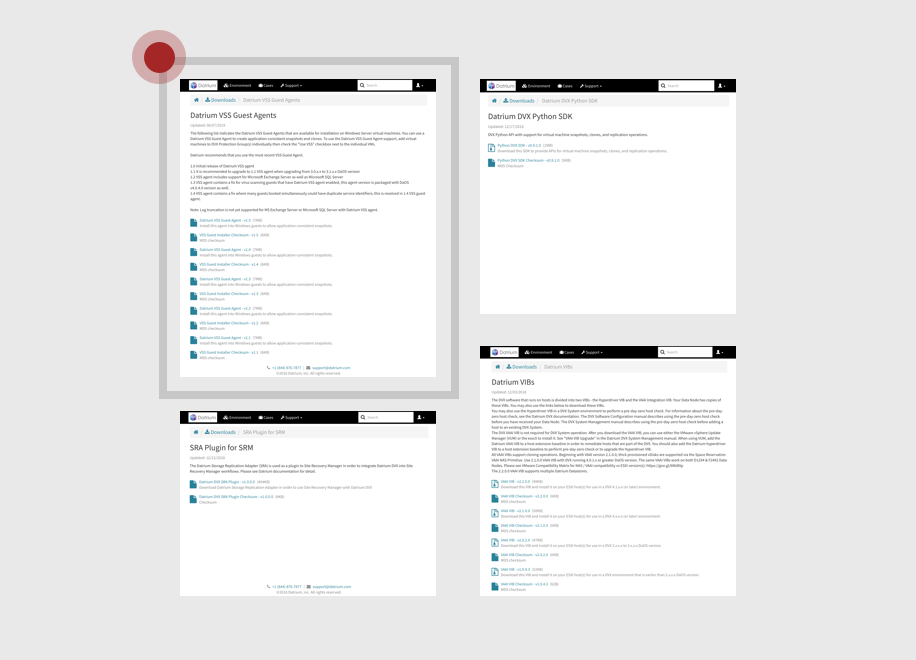
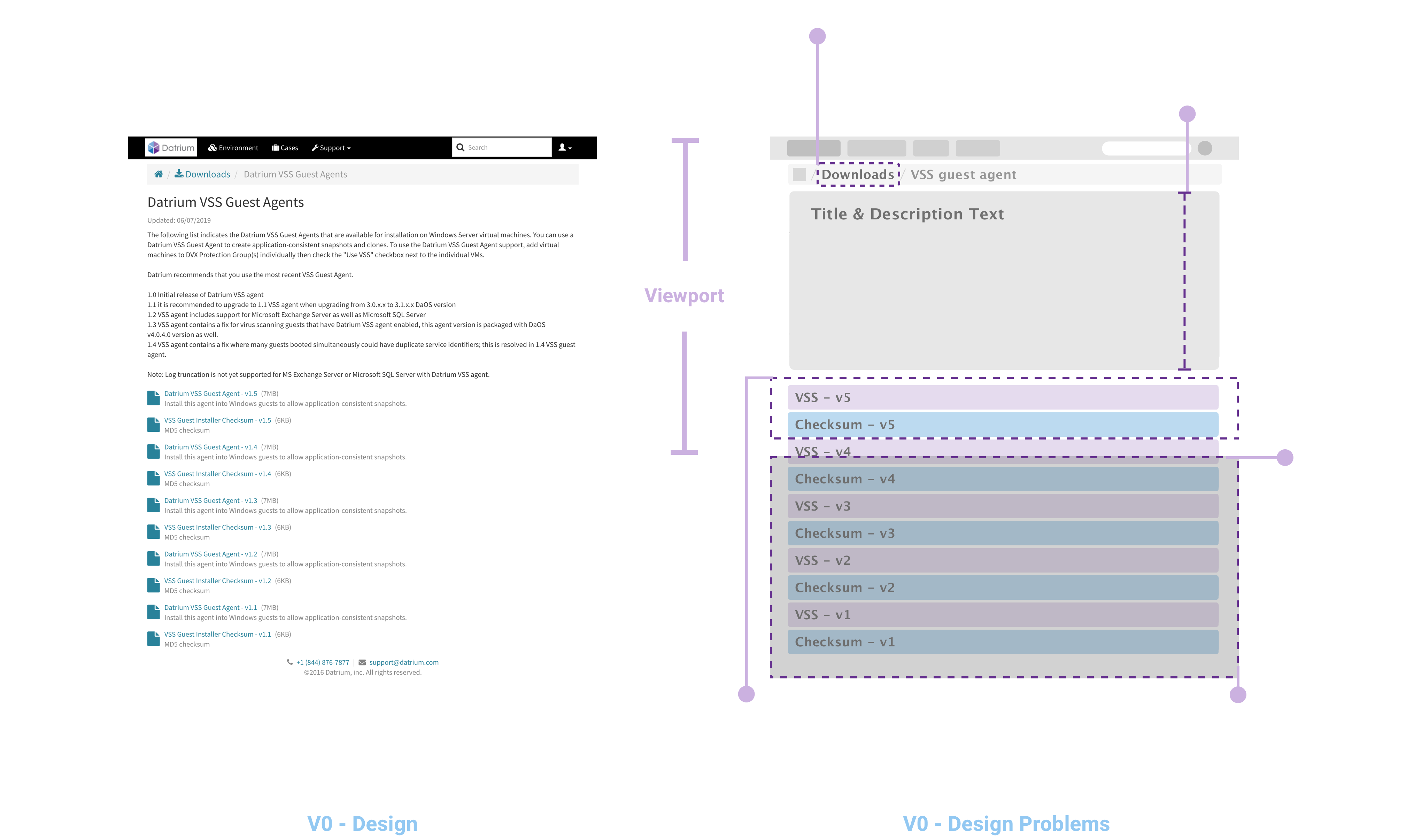
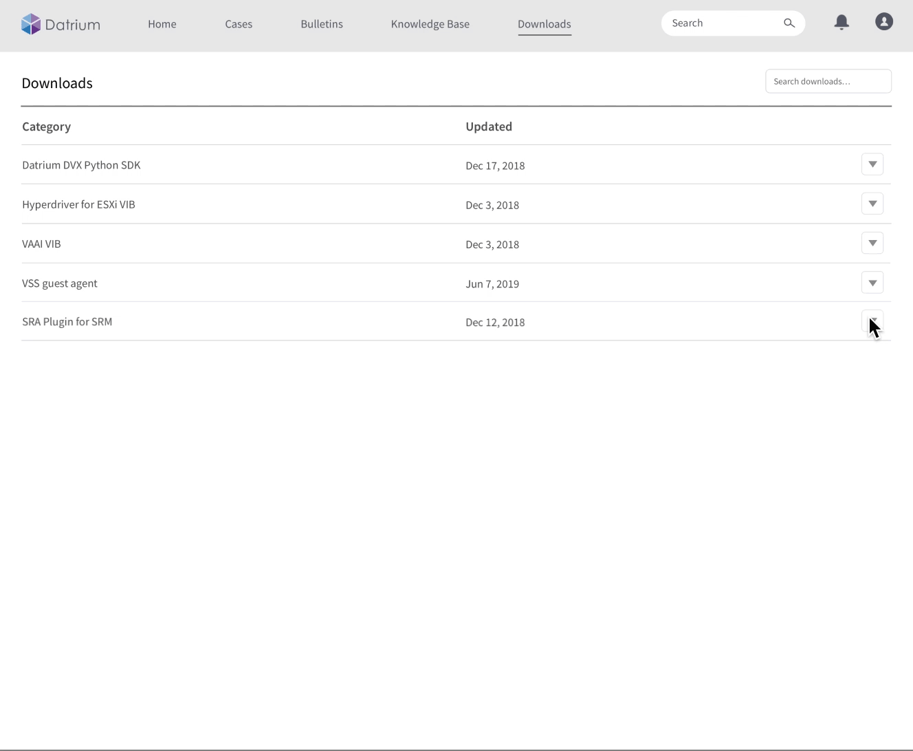
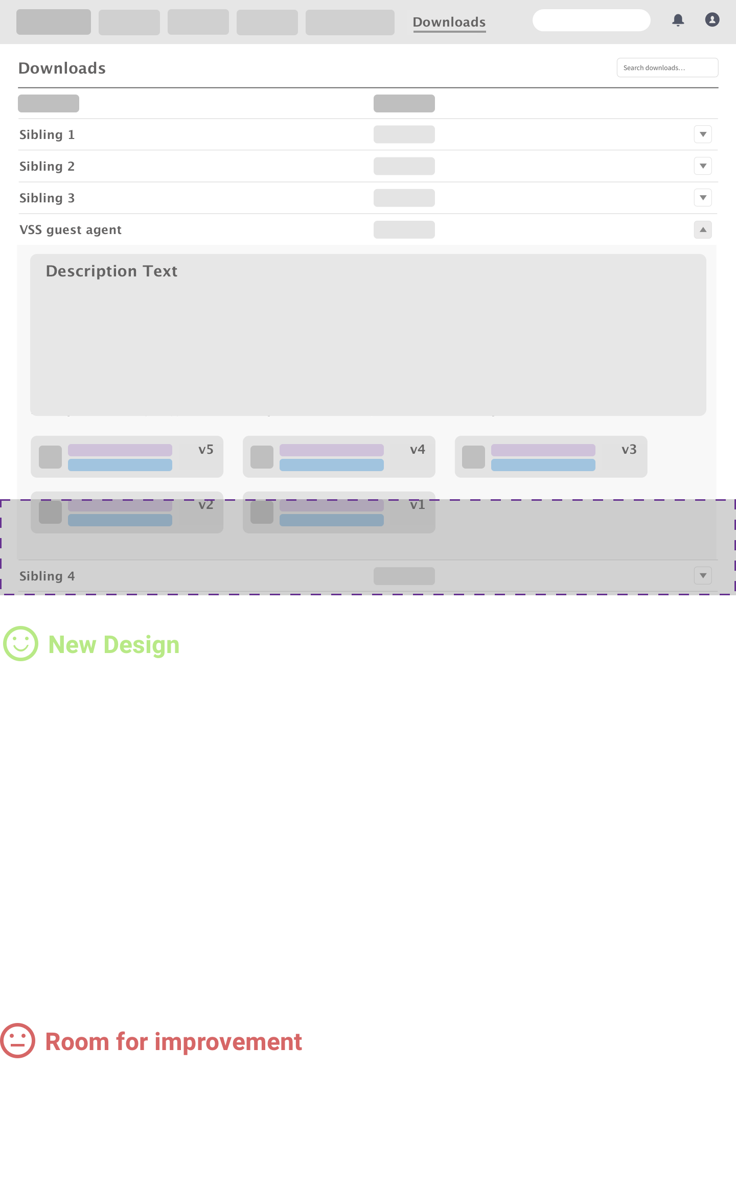
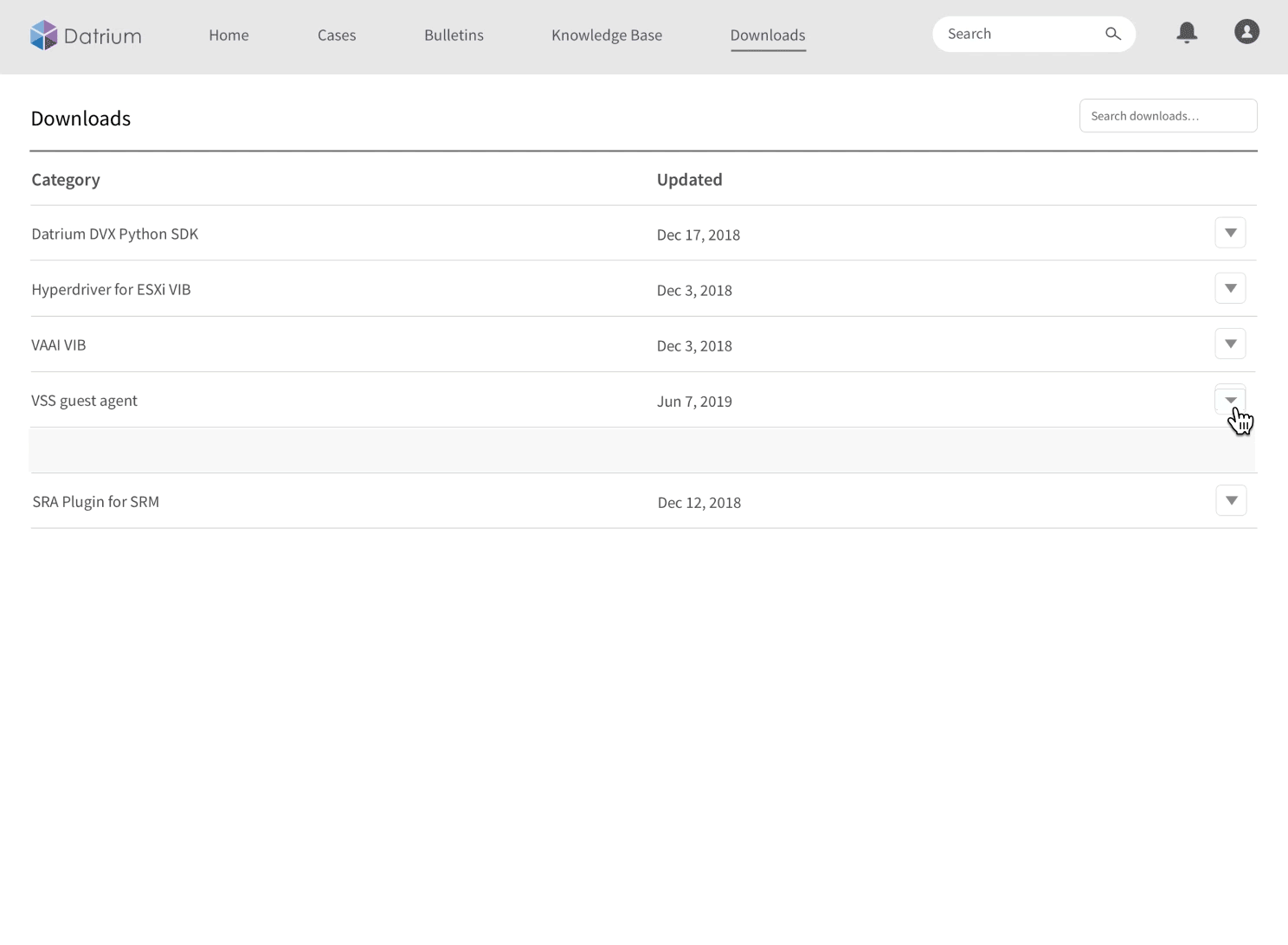
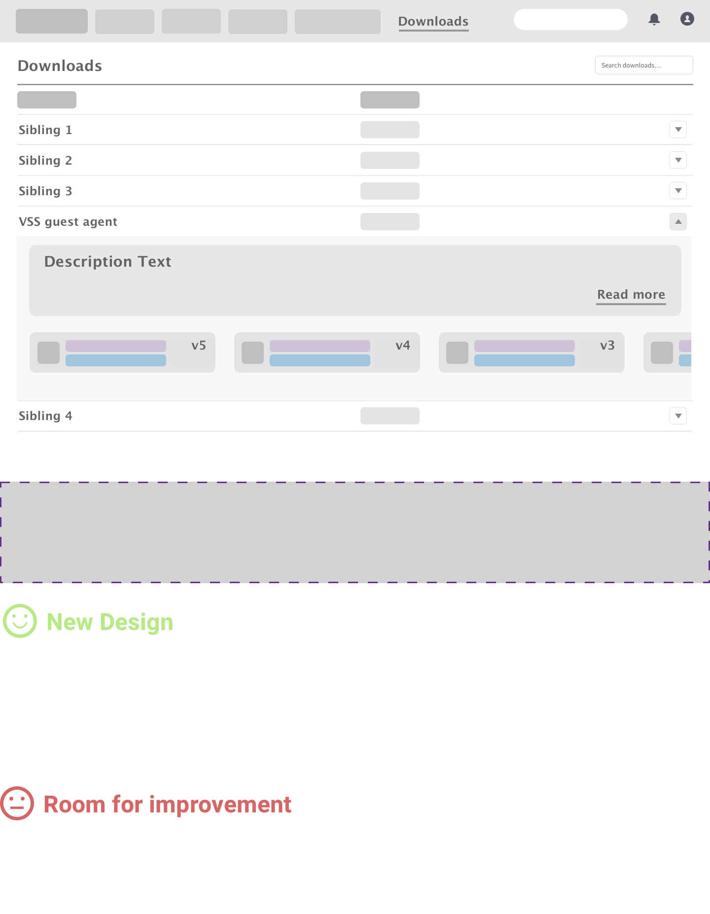
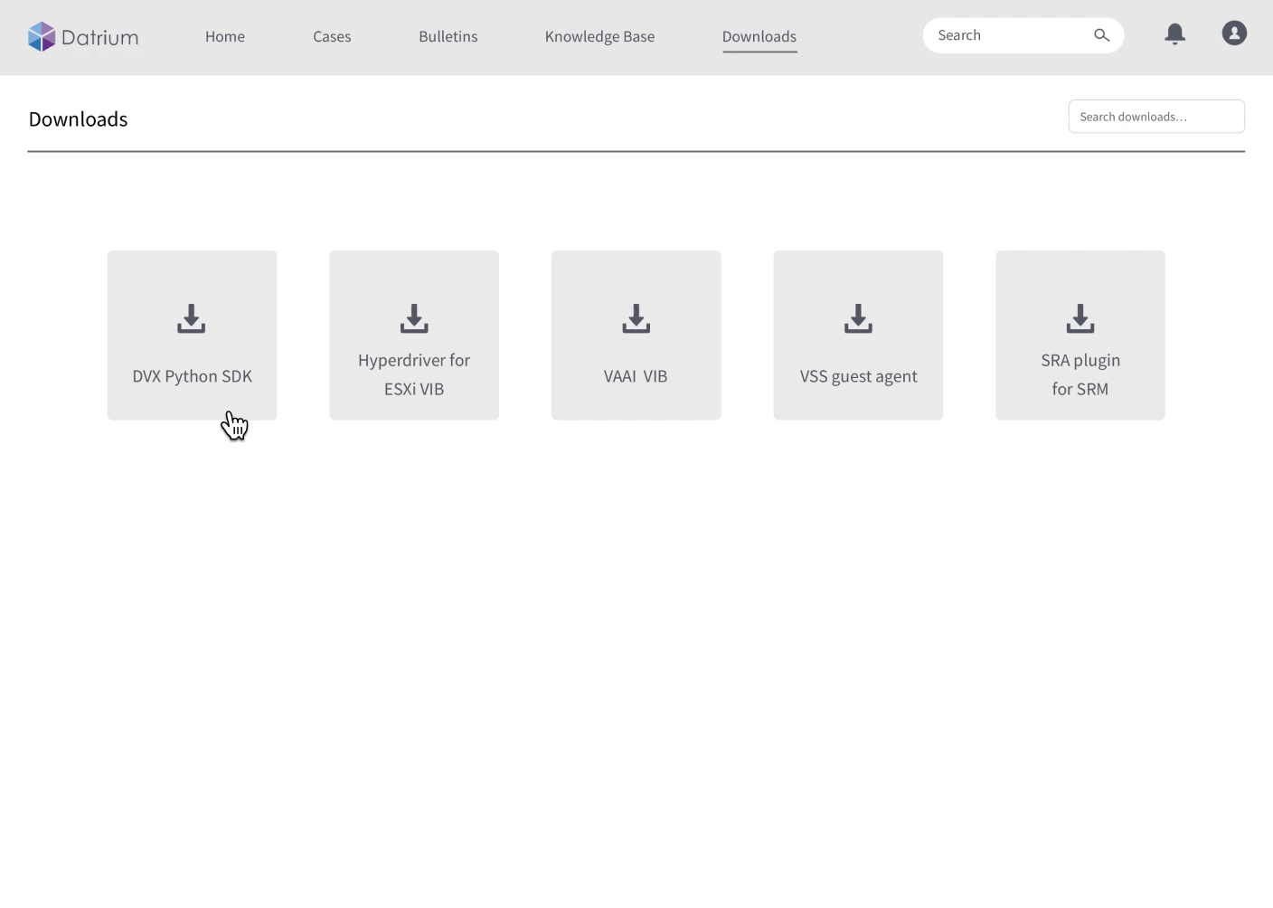
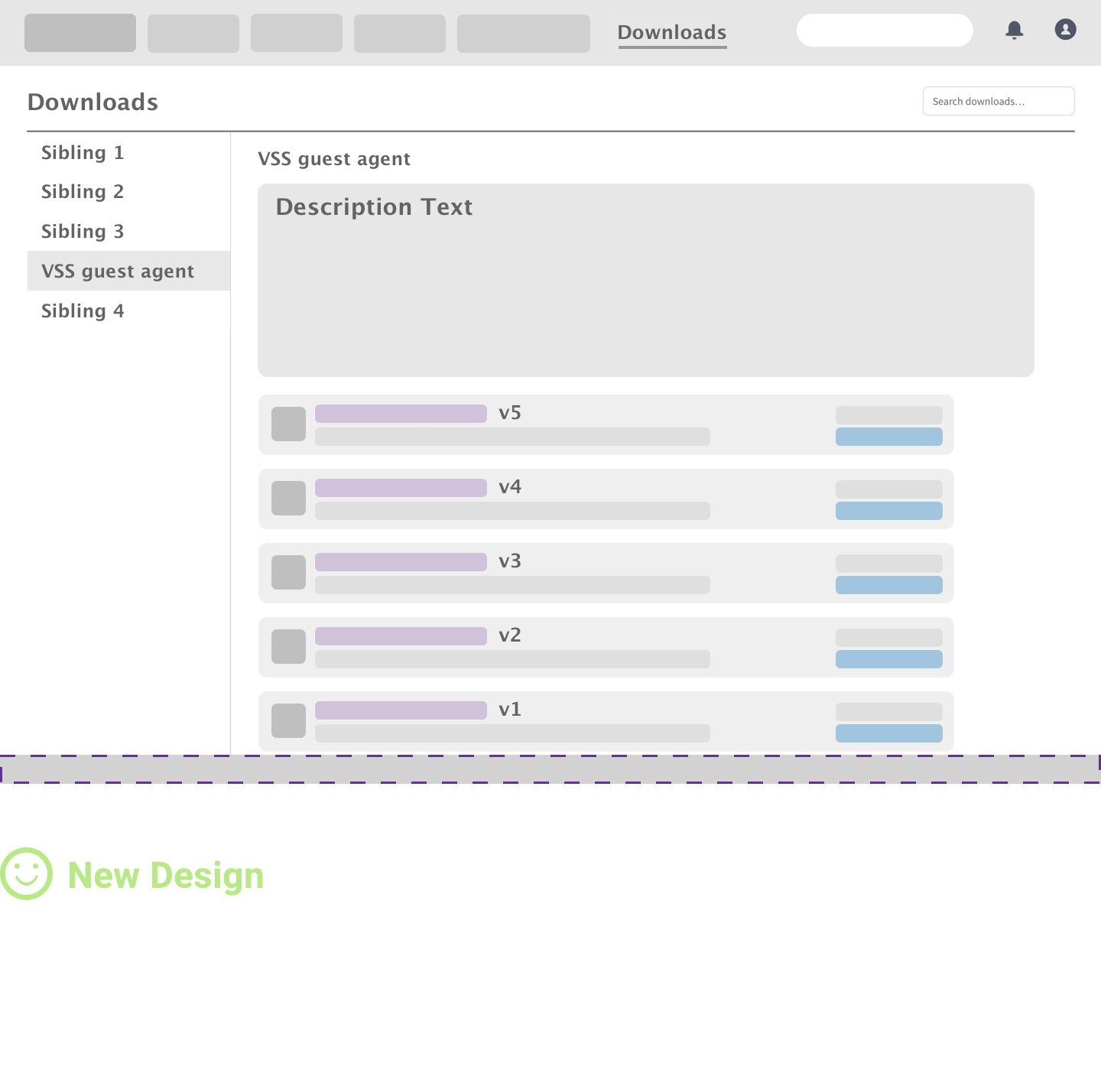
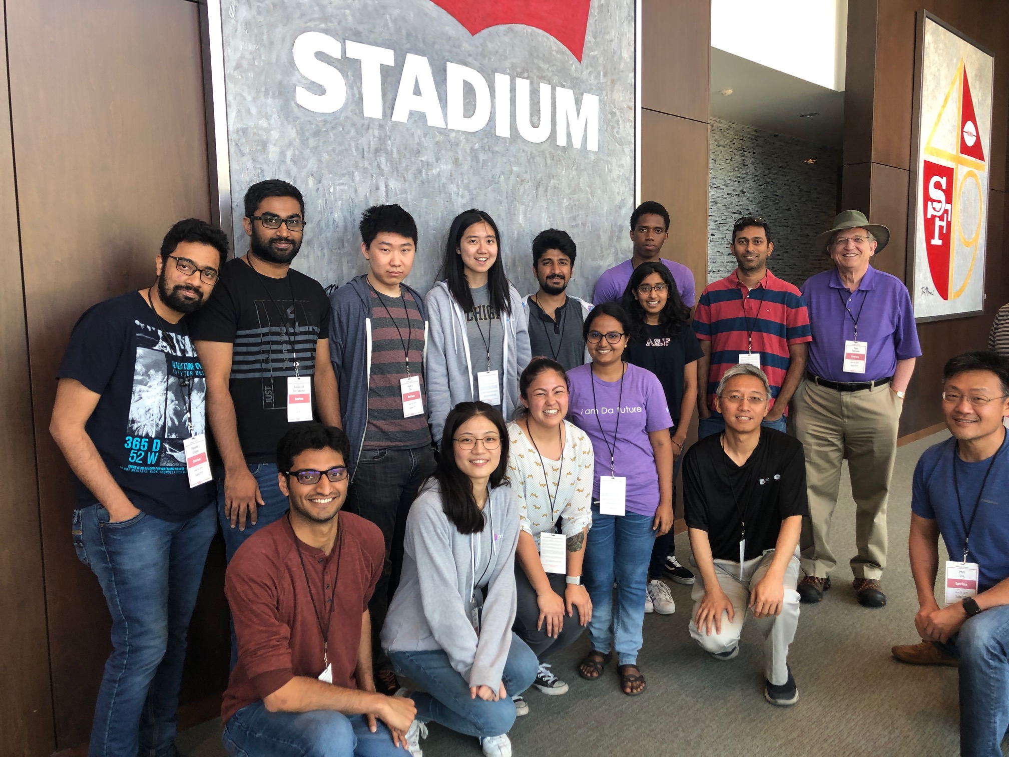
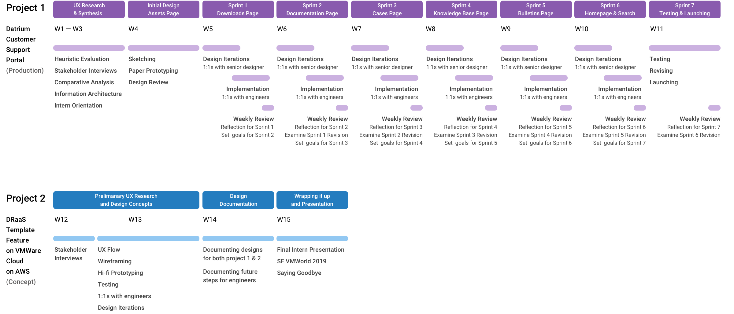
In the summer of 2019, I was fortunate enough to intern at Datrium in Sunnyvale, CA, and had an enjoyable experience with a bunch of amazing people.

My main job was to revamp Datrium’s outdated customer support portal, which was built in 2016. My work boosted the old portal from both UX and UI perspective, allowing Datrium’s enterprise customers to better manage their products and tasks. For instance, submitting and viewing cases, searching and browsing technical support bulletins and knowledge base, downloading software, and so much more.

Our team has already launched the alpha version of the new site in Q3 at https://datrium.force.com. Datrium’s CEO, Tim Page, even expressed his compliment over this new customer support portal in the Datrium Slack channel. (What a bummer I forgot to take a screenshot of this)


Mentor Recommendation
"I mentored Melody during her internship at Datrium. She was able to finish not one but two major projects over the summer, including one that went to production. Melody has a great attitude, has keen creative instincts, and is a quick learner."

Linkedin Recommendation  by Juan Casares
My Role
UX / UI Intern
Tools
Sketch and Axure RP
My Teammates
Juan Casares     Senior Product Designer    
Madhavi Javvaji    Software Engineer
Chaitanya Mamuduru     Software Engineer
Doug O'Shaughnessy     VP of Customer Support
Harish Dhurvasula     Director of Engineering
Cisco Josh     Technical Support Team Lead
Organization
Datrium Logo
Location
Sunnyvale, CA
Duration
May 2019 - Aug 2019

Background


Datrium is a B2B company that helps enterprises to preserve and secure their most valuable asset - data. They provide both separate and unified solutions to primary storage, backup, disaster recovery, encryption, and mobility. Datrium allows enterprises to purchase hardware (e.g., data nodes, compute nodes, DVX) as well as software (e.g., Disaster Recovery as a Software, DRaaS) from them to build their hybrid cloud, private cloud, and on-premises data centers.

When I joined the company, Datrium was developing its next-generation product, DRaaS with VMware Cloud on AWS, and aiming to release it by the end of August on VMWorld 2019. As the sole UX/UI intern at Datrium, my goal was to deliver a new customer support portal with good UX and UI by the upcoming release, not only to serve current customers better but to demonstrate our customer-first service to potential customers.

Starting with the MVP Features


Shifting the design focus from the most ideal design solution to the MVP mindset

At the beginning of my internship, my mentor and I set up the initial 3-month internship goal together, which was a well-rounded prototype of the new customer support portal with implementation to some degree.
Our expectation was that I would be able to spend more time exploring the most ideal solution rather than delving into the hi-fi design too soon.

However, in the fourth week of my internship, we were informed that the upper management was hoping the MVP of the new portal could be up and running by mid-August to catch the upcoming release of Datrium's
next-generation product, DRaaS. I then replanned the design schedule accordingly and shifted the focus from building the most ideal design solution to designing for the MVP. In the following six weeks, our team ran a sprint each week and set goals for the next sprint at the weekly review meeting.

The result turned out to be great - the new customer support portal was successfully launched and live on 8/15.


MVP features I was working on

Based on the research findings, I concluded several main user tasks of the customer support portal and mapped these tasks onto the corresponding web pages. I also drafted up the information architecture of the new portal and prioritized the primary ones as the MVP goals. The MVP features that I was working on are as follows.

(1)Homepage
     Allow users to quickly access those unread bulletins, open cases, and their assets’ licensing information.
(2)Assets Page
     Allow users to view their assets that were purchased from Datrium, e.g., data nodes, compute nodes, and edit      related information.
(3)Downloads Page
     Allow users to download the Datrium software packages they need and validate them via checksum
(4)Cases Page
     Allow users to view their customer support cases, including open cases and closed cases. Users can also open      a new case on this page to seek support whenever anything goes wrong.
(5)Documentation Page
     Allow users to view different types of documentations by categories and versions, including product      documentation, release notes, replacement guides, and best practices.
(6)Knowledge Base Page
     Allow users to view Datrium’s knowledge base articles by product types and versions.
(7)Bulletins Page
     Allow users to view the technical support bulletins, including unread bulletins and all bulletins. Users can also      mark all bulletins as read on this page.
(8)Search feature

Design Process

Challenges

user icon

Enterprise products and users
At the beginning of my internship, I spent so much time understanding the problem scope of Datrium’s product due to the lack of domain knowledge and its technical complexity. Another challenge of working on B2B products is that it’s hard for designers to get user feedback since enterprise users are usually busy and hard to access. I have to say the customer support portal is actually in the sense that between B2B and B2C. It serves Datrium’s enterprise customers, still, the user needs here, e.g., requiring customer support, are easier to empathize with than the Datrium’s core products.

salesforce icon

Design and technical constraints caused by Salesforce Communities templates
The new customer support portal needs to be built on top of Salesforce Communities templates, meaning implementation-wise, many components and functionalities are already pre-defined. These components are useful, still, they might not fit our user needs and branding perfectly, and can even become design constraints. For instance, some designs that can easily be implemented by front-end programming could be a different story here due to the limitations of the Salesforce framework. As a designer, I have to strike a balance between designing based on these components' constraints and requesting front-end customization from engineers for better UX.

Recap of the old customer support portal

Below are some screenshots I took from the old customer support portal before the revamp. If you are curious about how I got to the final design, hang in there! I will be sharing the detailed redesign process and rationale in my later design stories.


Now you've got a rough idea about what the old customer support portal looks like.
Let's take a quick look at our newly launched portal before I delve into my design stories.


Homepage

Access important customer support related updates in no time.

In the new version of the homepage, I created three dashboards showcasing important information to users, including unread bulletins, open cases, and asset licensing information. Now users will be informed of those recent updates once they log in to the portal. They’ll also be able to dismiss the unread bulletins by the blue cross or go to each corresponding page by clicking the view all button.


Downloads

Download the Datrium software package you'd like and quickly
validate it via the checksum.

To provide the best experience of the Datrium’s products, some software is required to download by customers. On the downloads page, users will be able to locate the target download by the left sidebar and download it by clicking either the blue download icon or the package title. After downloading, users will also be able to validate the package via the MD5 checksum.


Technical Support Bulletins

Check out all your unread/read Datrium bulletins
or mark them all as read.

Technical support bulletins are short announcements used to inform Datrium’s customers of newly identified issues and recommended fixes. In the new portal, we separated TSBs from KBs and created an “unread” tab for users to quickly identify what TSBs are still waiting for them to go through. Users will also be able to dismiss one or more/all unread bulletins at once by clicking mark as read.


Documentation

Get the documentation you're looking for by categories and versions.

There are four types of Datrium documentation, including product documentation, release notes, replacement guides, and best practices. Users will be able to locate the target documentation via the left sidebar. Under each section, users can filter out the documentation with a specific version by selecting the version filter above.


Search

Search a keyword and see the
results by categories immediately.

In my initial design, there are two search bars, which are the sitewide search bar and the page-specific search bar. However, due to the functionality limitation of the Salesforce component, the
page-specific search bar can only search the title of a doc instead of its content. Hence, in the MVP, our team decided to remove the page-specific search bar and mitigate this technical constraint by providing tab categories for the search results to users.


Knowledge Base

Find the solution to your concerns right away by Datrium’s knowledge base.

The Datrium knowledge base contains information such as frequently asked questions, step-by-step process guides, and article/video demonstrations.
It allows customers to help themselves when the support team is not available. On the other hand, it can reduce the support team’s burden if the customer can get the answer and solve the problem before filing the support case.


Cases

Got a problem with your Datrium products? Let’s create a case!

In the new version of the Cases page, I created three tabs for users to view the cases they created, including open cases, closed cases, and all cases. Whenever users feel there’s something wrong with their Datrium products, they will be able to create a case via the call-to-action “New Case” button with the newly revamped pop-up window that caters users’ and the business’ needs better.


Assets

Check out all your Datrium assets, including compute nodes and data nodes.

On the Assets page, users will be able to look into all the Datrium products they purchased, including compute nodes and data nodes. Compute nodes are servers that write to data nodes, whereas data nodes are physical hardware appliances for storage. After clicking into each node, users can view more Asset information, such as the support contract details and the node’s current address.

Design Stories


The above is just our newly launched customer support portal at a glance, now you’ve got an idea of what my final design is like. As you can imagine, there are numerous stories of iterations behind all the MVP features I was working on. Here, I handpicked three essential stories to share the highlights of how I solved the problems throughout the head-to-toe UX process.

During my internship, I iterated my design based on feedback for the MVP features mainly by paper prototyping under a tight sprint time constraint. In the following stories, I redid them into digital prototypes to better illustrate my iterations and design rationale.

Now, let’s get started!

Story #1

How did I design a seamless downloading experience
with good scalability and visibility?

Before delving into the process, I wanted to let you know that there will be five categories of downloads on the new Datrium’s customer support portal, including
1. Datrium DVX Python SDK
2. Hyperdriver for ESXi VIB
3. VAAI VIB
4. VSS guest agent
5. SRA Plugin for SRM

Below is the downloading experience user flow of the old support portal, which I called Version Zero (V0).

User Flow of V0


Upon analyzing the current user flow, I discovered two major UX flow problems, which are
1. the lack of entry points for the downloads page
and
2. the lack of entry points for other download siblings.

After looking into the four downloads of the old portal, I realized that the VSS guest agent page is currently the one that has most download packages and text-heavy description, resulting in higher friction compared with others. As a result, I took the VSS guest agent page as the starting point and the benchmark in my following redesign process.


VSS guest agent - Design Problems with Version O

Based on the findings of the heuristic evaluation, I identified several problems of V0 design, including

  • Zero visibility and low discoverability for download siblings
  • The description text area is so huge that overshadows the packages
  • No visual clues (e.g., proximity, similarity) provided for identifying the same version package and the checksum
  • Low visibility for packages since most of them are under viewport
  • When scrolling down, viewing all packages in the viewport could be overwhelming

With these findings in mind, I then designed V1 to tackle the above problems accordingly.


Downloads - Design Version 1


What V1 design brings to users.

In V1, I added a Downloads tab to the navigation bar to increase the entry points for the Downloads page. I also visualized the download siblings to increase the entry points, visibility, and discoverability for the downloads. Now, after users get into a specific download, they can quickly jump to other siblings without going back and forth to the Downloads entry page.

Another new design in V1 is the grouping of the same version package and the checksum. After 1:1s with engineers, I learned that checksum was just a string of digits for verification purposes. Now in V1, users will be able to get the checksum by just hovering instead of downloading the whole checksum package. By doing so, I not only raised the ease of recognizing the same version package and the checksum but also saved lots of visual space.


Still, there’s room for improvement in scalability.

Although it may seem like most problems of V0 are solved in V1, this solution is still not perfect. Through the design review session, I identified some potential scalability issues lying behind V1. Given that each download category has an inconsistent length of the description text and a different number of packages, opening up multiple download categories at once could result in unpleasant user experience. For instance, pushing the lower download categories out of the viewport, or requiring time-consuming scrolling to locate the target download package since the vertical space of each download is unpredictable.

To solve these scalability issues, I came up with a more scalable V2 design.


Downloads - Design Version 2


How did I improve scalability in V2?

In V2, I added a “Read more” button so that the description text will be half-folded by default. This button gives users the freedom to choose whether to read the full description or not in the first place.

I also changed the way I arranged the download packages. In V2, I replaced the original waterfall display with the horizontal scrollable layout, giving each category the same height despite the number of packages. However, when the packages are more than three, this layout will hide some older versions. Even so, considering the general user goal for downloading is looking for updated versions that will be visible on the left side, this pitfall seems to be relatively minor.

Compared with V1, V2 saved lots of vertical space and solved the viewport problem. It also standardized the vertical space that each category has taken. Now, when users open up multiple downloads, the UI pattern is much more predictable than V1, which brings better UX.


However, the engineering efforts that V2 design will cost is too high in the MVP phase.

After having 1:1s with engineers, I realized that implementing the horizontal scrollable layout will require high engineering customization efforts due to its complexity and the fact that the Salesforce framework does not currently support this. From a practical perspective, this design wasn’t a good fit for the MVP and the sprint context. Through the design review, I also learned that V2 might cause potential friction since it requires many interaction steps for edge cases.

With feedback from engineers and the senior designer, I designed V3, which requires less engineering efforts and is more intuitive to users.


Downloads - Design Version 3


Designing a more intuitive downloading experience with less engineering efforts.

In V3, I replaced the accordion design with left-sidebar navigation for displaying downloads’ titles. This change pushed the visual space of the titles to the left side of the screen so that the ceiling became higher for the description text and the download packages. Users now will be able to download smoothly for any category without compromising the visibility of the description text and the packages in the first place.

V3 also excluded the use case that allows users to open up multiple downloads at once, providing better scalability than both V2 and V1. Moreover, by adopting the left-sidebar navigation and taking off the accordion design, the “Read more” button, and the horizontal scrollable layout, I successfully reduced the engineering efforts, interaction steps, and potential friction for users in V3.

After syncing with the senior designer and engineers with some more iterations, this design went to production and shipped successfully by the end of the sprint.

The Datrium color palette I referred to when designing the UI

 Primary
 Secondary
 Accent
 Gradient
Me and other amazing interns and mentors visiting our client's data center at Levi's Stadium, Santa Clara.


intern group photo at levi's stadium